
CSS is a great way for web developers to keep style and content separate. You can use it for things like styling block quotes in WordPress, but it can also be so much more than that. In this article, we’ll take a look at five things you can do with advanced CSS that you may not know about and will help take your web pages to the next level.
Variables: CSS Custom Properties
Before we had CSS Custom Properties, we had CSS preprocessors. These include Sass, Stylus, Less, and a whole host of others. While preprocessors aren’t going away anytime soon, there’s another way to use variables within your CSS code: CSS Custom Properties.
Like CSS preprocessors, CSS Custom Properties allow you to define and use variables within your CSS code, making things more DRY (don’t repeat yourself). However, there are a few benefits to using CSS Custom Properties:
- Native support. You don’t need a preprocessor.
- Cascading. You can easily override values inside selectors.
- Live updates. You can change values inside media queries and you can access variables in JavaScript.
Let’s pull apart how CSS Custom Properties are created and used. The first step is to set the value.
How to set the value
Before setting a value, you must first decide on a property name. Then, prefix that name with --. For example:
:root {
  --primary-color: #752914;
  --secondary-color: #6397AF;
}
In the example above, there are two properties: primary-color and secondary color.
The second step is to use the property in the style sheet.
Accessing the value inside the variable
To retrieve and use the values stored inside a property, you must call the var() function, and then pass in the property name:
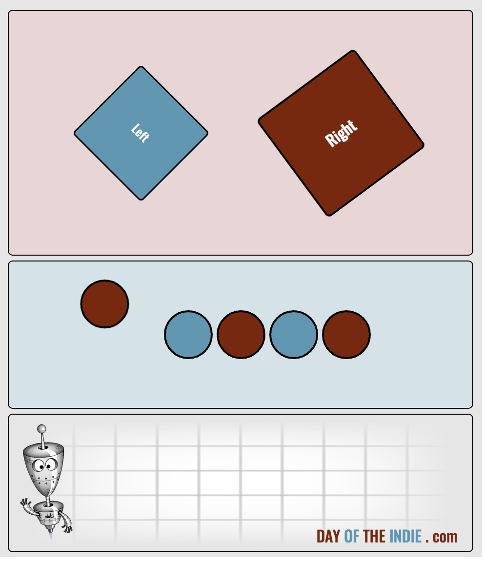
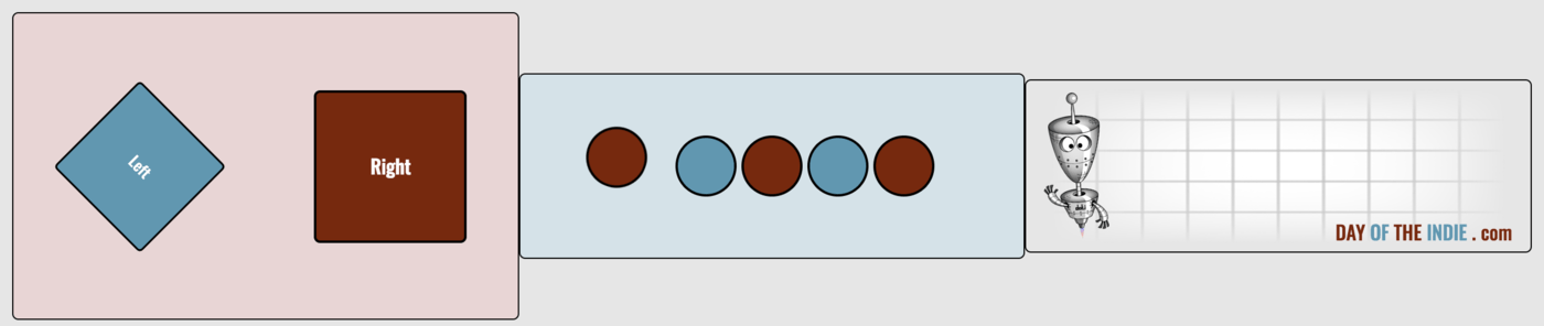
.square-left {
  background: var(--secondary-color);
}

.square-right {
  background: var(--primary-color);
}
In the example above, the background values get set to the appropriate color. The cool thing is… you can call that property from anywhere within the style sheet, and if the value ever needs to change, you only need to update it in one place.
Layout & Display: Flexbox
Long ago web developers had to use some interesting tricks to get things to look good. We relied mostly on tables — and in some case tables inside tables — to help. Then, one day, the div was born, and things got better. But it didn’t stop there. With CSS3, a new concept was introduced: Flexbox.
The Flexbox doesn’t replace the div; it extends its capability. In fact, the concept of the Flexbox is more about the layout mode rather than the element.
When working with a Flexbox, there are three things to consider: flex containers, flex items, and flex lines. As you might have guessed, a flex container holds the flex items, and those items are positioned along a flex line, of which there is only one per container.
Let’s take a look at an example:
.container {
  background: #E6E6E6;
  display: flex;
  flex-direction: column;
  align-items: center;
  padding: 5px 10px;
}
In the example above, a div is being defined as a flex container; its direction is set to display the items in a column; and its items are set to be center aligned. The result would look like this:
If you were to change the flex-direction to row, which is the default value, the result would look like this:
With a Flexbox, you’re able to have greater control with your layout and design. This helps when you’re dealing with different screen sizes and devices.
Find out more about the Flexbox, along with its other properties, at W3Schools.
Selectors: nth-child and nth-last-child
Have you ever had a group of elements you wish you could examine, and then take some type of action based on its location within that group? Guess what? You can with nth-child and nth-last-child.
Let’s take a look at how :nth-child(n) works.
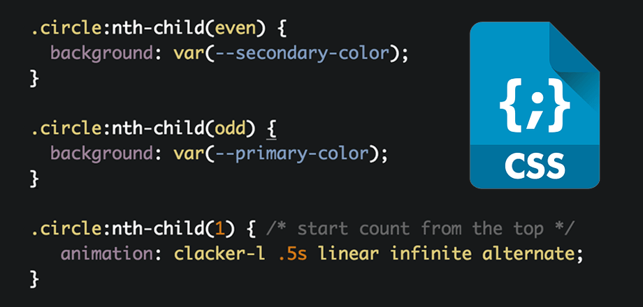
.circle:nth-child(even) {
  background: var(--secondary-color);
}
In the example above, every even-numbered element is being selected, and then having its background set to the value stored in --secondary-color. Of course, you can also use the keyword odd to select the odd-numbered ones too.
.circle:nth-child(odd) {
  background: var(--primary-color);
}
Or, you can select a particular element using its numerical position (index) by passing in the appropriate value:
.circle:nth-child(1) {
   animation: clacker-l .5s linear infinite alternate;
}
In the example above, this selects the first element.
If you’d like to start the count from the last child element, you can using :nth-last-child(n):
.circle:nth-last-child(1) {
   animation: clacker-r .5s linear infinite alternate;
}
In this example, the last child element will be selected. If you wanted to select the second-to-last, you’d use .circle:nth-last-child(2) instead.
There are a variety of CSS Selectors available to help us write more efficient CSS code. These happen to be my two favorite, and the ones I use the most. For more information, and to see a complete list of selectors, check out the CSS Selector Reference at W3Schools.
CSS Animations
One of my favorite things about CSS is having the ability to animate elements; and it’s more than just moving elements on the screen. You can even use CSS Animations to smoothy change how an element appears. For example, it’s color.
Working with animations requires a few steps. You first need to set up and define your keyframes and then you need to define the animation properties, such as timing, iteration, and direction. Once that’s done, you attach the animation to an element. You can also re-use keyframes and bind these to new animations/elements.
Creating Keyframes
Keyframes are what you use to define your CSS animation. Basically, this is where you set the various stages of your animation — in other words, the from->to state — and where you name it:
@keyframes clacker-m {
  from { background: var(--primary-color); }
  to { background: var(--secondary-color); }
}
In the example above, the animation is named clacker-m, and it animates the element’s background from the valued stored in primary-color to the value stored in secondary-color. The keyword words from and to are commonly used to indicate the starting and ending points of the animation, but you do not need to use these.
Alternatively, you can use percentages:
@keyframes clacker-m {
  0% { background: var(--primary-color); }
  100% { background: var(--secondary-color); }
}
You can even add additional keyframes which will be called throughout the duration of the animation at the percentage-point specified:
@keyframes clacker-m-alt {
  0% { background: var(--primary-color); }
  25% { background: #5BB649; }
  100% { background: var(--secondary-color); }
}
Setting the animation properties
Once you have the keyframes defined, the next step is to set up the animation properties. The animation properties determine how the animation will run. They include:
- animation-delay
- animation-direction
- animation-duration
- animation-fill-mode
- animation-iteration-count
- animation-name
- animation-play-state
- animation-timing-function
You may set each of these individually, or you may use the animation shorthand. Take a look:
animation-name: spin;
animation-duration: 3s;
animation-timing-function: linear;
animation-delay: 0.5s;
animation-iteration-count: infinite;
animation-direction: reverse;
animation-fill-mode: both;
animation-play-state: paused;
In the example above, each property is set individually.
If you wanted to use the shorthand, it would look like this:
animation: spin 3s linear 0.5s infinite reverse both paused;
The order in which each property is specified is not important. However, you should always start with the animation name first. In addition, you may choose to omit the optional properties and properties for which the default values are used.
Attaching the animation to an element
If you’re wondering where you set those animation properties and how you bind it to an element, that’;s done when you define the class the element is using:
.square-right {
  animation: spin 6s linear infinite paused;
}
In the example above, the animation is bound to the .square-right class, which is being used on a div:
<div class="squares">
  <div class="square square-left">Left</div>
  <div class="square square-right">Right</div>
</div>
If you wanted to reuse that same animation on another div, or perhaps run it in the opposite direction, you could do so like this:
.square-right {
  animation: spin 3s linear infinite reverse;
}
For more information about CSS Animations, check the CSS3 Animations Reference at W3Schools.
Note: The CodePen demo uses CSS Transformations which will be explained in the next section.
CSS Transformations
One of the most powerful things you can do with CSS is transform your elements. Transformations can be done in 2D or 3D space, and can include things like position, rotation, scaling, skewing, and perspective. They can be used with static designs and CSS animations.
For example, if you wanted to create a rotating 3D box, you can start with a single square shape, and then rotate and translate each square (side) to achieve this 3D effect.
The relevant CSS code would look something like this:
.s1 {
  transform: translateZ(-60px);
}
.s2 {
  transform: translateY(-60px) rotateX(90deg);
}
.s3 {
  transform: translateY(60px) rotateX(90deg);
}
.s4 {
  transform: translateZ(60px);
}
.s5 {
  transform: translateX(-60px) rotateY(90deg);
}
.s6 {
  transform: translateX(60px) rotateY(90deg);
}
In the example above, each element is translated on the appropriate axis and then rotated according to which side of the box it completes. You then need to set the perspective and transform style:
/* on the container */
perspective-origin: 50% 50%;
perspective: 1200px;

/* on the element */
transform-style: preserve-3d;
Once that’s done, you create the keyframe animations:
@keyframes rotate {
  100% { transform: rotateX(360deg) rotateY(360deg) translateZ(40px); }
}
Finally, you attach the animation to the element:
animation: rotate 8s linear infinite backwards;
You now have a fancy looking rotating 3D box, all done in CSS.
This has only scratched the surface with what can be done with transformations. For more information, see the CSS3 2D Transforms and CSS3 3D Transforms references at W3Schools.
Conclusion
When you combine transformations with animations, and then bring in the power of custom properties, flexible display settings, and better ways to target and select elements, your web pages will come to life.
Today, more than ever, some incredible things are being done with online content. Many of those things are possible using only CSS and HTML.
It’s true what they say: you’re really only limited by your imagination. Happy CSS’ing.