Generate qualified leads. Increase conversions. Drive revenue.
These three initiatives are at the top of every digital marketer’s to-do list. They’re also incredibly difficult to achieve. Generating leads is so difficult, in fact, that 65% of marketers say its the single biggest challenge they face (according to HubSpot’s 2016 report).
If you’re like these marketers and you’re discouraged with your lead generation struggles, don’t give up just yet. We’re here to explain how you can increase qualified leads with squeeze pages–a type of landing page specifically designed to capture customer information for the purpose of lead generation.
Here are 4 steps to planning, designing, launching, and tracking effective squeeze pages.
1. Campaigns That Provide Value
Many marketers see squeeze pages as an opportunity to promote their product. This is an ineffective approach because it fails to provide value. And if people don’t see any value in what you’re offering them, why would they provide their contact information?
To craft a campaign that’s perceived as valuable, you must consider your buyer personas. What are their implicit motivations for buying your product? Maybe they want to improve their performance at work, or maybe they’re motivated by something more personal. Understanding these types of personal motivations and desires is essential for connecting with your audience on an emotional level. These same considerations are important for helping you decide what type of content you gate behind your squeeze page. Whether it’s an eBook, a white paper or a case study, allow the needs and desires of your audience to guide you.
2. Your Audience’s Pain Points
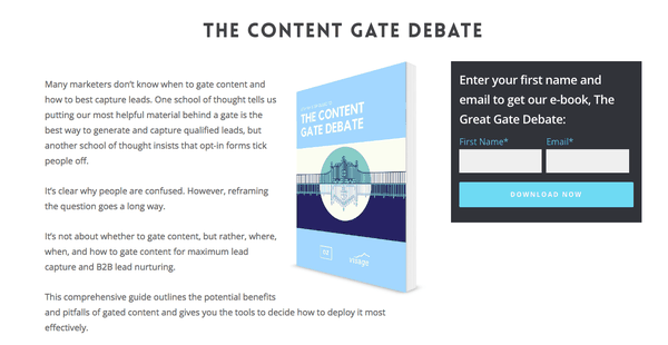
The most effective squeeze pages guide visitors through a three-part sequence: pain, understanding, and solution. To see how these three parts work together in action, take a look at how Oz Content targets its audience’s pain points.
On the squeeze page for its eBook “The Content Gate Debate,” Oz Content attracts the reader by relating to a pain point in the very first line: “Many marketers don’t know when to gate content and how to best capture leads.” This relates to Oz Content’s target audience (marketing professionals) in a simple, yet powerful way. Next, Oz Content generates intrigue and excitement by planting a seed in the reader’s head: what if we reframed this age-old question?
Lastly, a squeeze page has to provide a tangible solution to the audience’s pain. As an InVision article suggests: “Show them how much better life could be if that pain were fixed. See them out of the nightmare and into the dream.” Oz Content shows its audience out of their nightmare (confusion about gated content) with this powerful line: “It’s not about whether to gate content, but rather, where, when, and how to gate content for maximum lead capture and B2B lead nurturing.”
Intriguing, right?
This sequence is followed by a summary of the piece’s key takeaways. Bullet points are a great way to help viewers quickly grasp what the content has to offer. And while you do want the reader to understand why they need the offer, you don’t want to give away so much information on the landing page that the offer isn’t helpful. Effective squeeze pages balance informative statements with points of intrigue, leaving the content to reveal a few golden nuggets that delight the reader.
3. The Use of Minimal Design
Getting people to your landing page is an incredible feat, but it’s only half the battle. For visitors to give up their contact information, it’s key to minimize distractions. Be sure to eliminate all extra links, buttons, and navigation capabilities that can lead your audience astray.
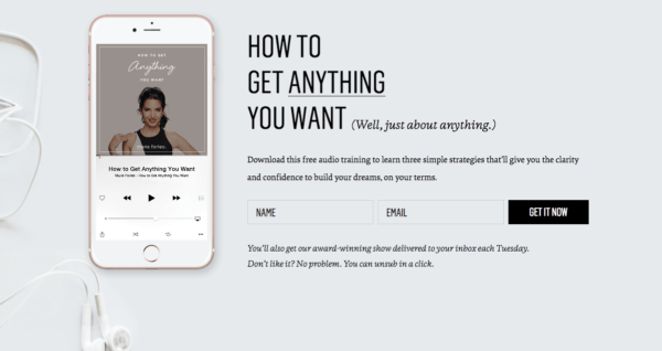
Just take a look at this landing page example from life coach Marie Forleo. This landing page promotes Forleo’s award-winning audio training with a crisp gray background and clean, modern design. As you can see, visitors only have two choices here: to fill out the form or exit the window. Reducing the number of choices is a great strategy for increasing signup numbers.
Forleo’s minimally designed page also raises a common industry question: how many form fields do effective squeeze pages have? Rather than relying on a magic number to answer this, consider the main goals you’re trying to achieve. For companies who want to increase lead quantity, it’s a good idea to stick with just one or two form fields. Companies who prefer quality over quantity may want to include more details, like company name and job role.
4. Testing and Tracking for Optimization
After you’ve assembled your page with effective copy and compelling design, it’s important to check for consistency across language, design, and visual elements. Is your body copy aligned with your headline and CTA? Do your visual elements align with the piece of content being offered? If your squeeze page is tied to an email or social media campaign, be sure to check for consistency there as well.
After evaluating your squeeze page for consistency, it’s critical to test your page elements for optimal conversion. There are many A/B testing tools for WordPress that make it easy to evaluate different elements on your site. If you’re new to landing page testing, consider these three areas:
Headline
Create a handful of varying headline options to see which language best resonates with your audience. Also, try different combinations of font colors and sizes to determine if that has an impact on conversions.
CTA Copy
Try testing different actionable phrases like “Get started!” and “Get my free eBook!” to get a feel for what language your audience prefers.
CTA Style
Whether your squeeze page has 3 calls to action or just one, it’s important to test their visual appeal. Implement different shapes and button colors in individual tests to see how they perform.
If you’re new to A/B testing, remember that many tools offer advanced analytics functionality, such as heat mapping and custom reporting, which simplify the process considerably.
If you enjoyed this post on creating effective squeeze pages, check out our three-part series on content marketing strategy.
