
If the design and layout of your website isn’t mobile-friendly, then you could be turning away the growing number of internet users who are visiting websites on their small screen devices.
While choosing a responsive WordPress theme, or converting your existing theme to a mobile-friendly version is the preferred option for many site owners, you can get a similar effect by installing a free plugin.
WPtouch is a plugin that displays a mobile-friendly version of your website to visitors who are accessing your website on a small screen mobile device. Your existing content is still used, however it is now displayed in a mobile-friendly layout, with a navigation system that is easy to interact with on a smartphone or tablet.
In this post we will take a look at this plugin to demonstrate how you can quickly make your WordPress website mobile-friendly.
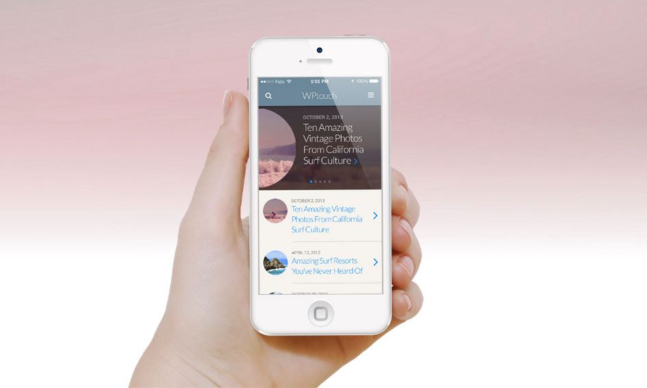
How to Make Your Website Mobile Responsive with WPtouch
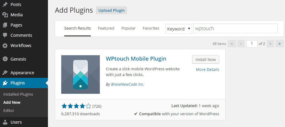
As there is a free version of WPtouch available, it can be installed on your site directly from the WordPress plugin directory
To do so, log into your site’s admin area (http://yoursite.com/wp-login.php) and then navigate to Plugins > Add New using the sidebar menu.
From the Add Plugins screen, enter ‘wptouch’ in the search field and then install the first item listed in the results.
After being installed and activated, the WPtouch dashboard can be accessed from the newly added item on the admin sidebar menu on your site’s dashboard.
Configuring Your Mobile Friendly Website
From the Core Settings you can define how your website will be displayed when viewed on a mobile device.
This includes setting a more mobile-friendly site title and byline, and defining which landing page to direct visitors to when they arrive at your site.
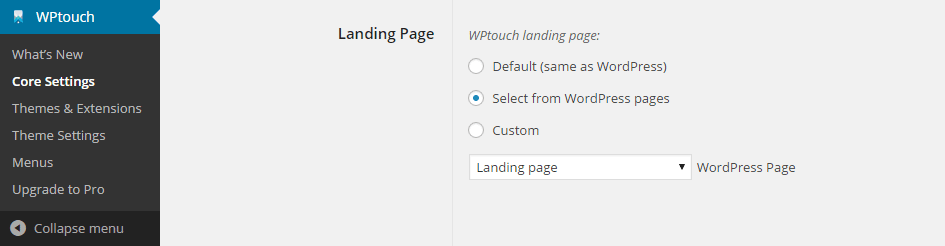
This setting is particularly useful if you want to display a certain page on your site to mobile users. This could include presenting visitors with the opportunity to download an app, or some other mobile-related offer.
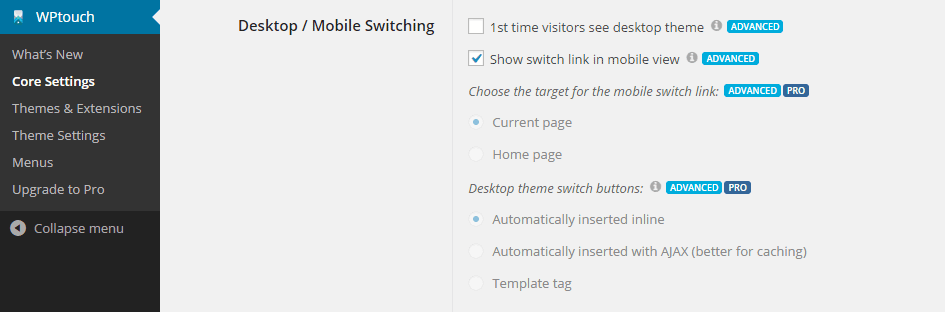
Through the advanced settings you can decide whether to allow visitors to switch between mobile and desktop views.
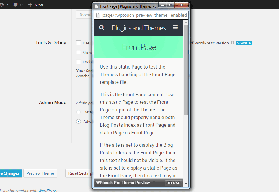
At any point during the configuration process you can take a look at how your website will be displayed on a smaller screen by clicking the preview button. This opens a new smaller browser window, containing the mobile version of your website.
Through the settings under the compatibility tab, it’s possible to remove individual shortcodes when WPtouch is active. This can result is a more mobile-friendly version of your website being rendered.
Another option on offer is to limit the function of WPtouch on specific URL or pages on your site. This can include only enabling WPtouch on a list of pages, or not enabling WPtouch on a list of pages. If you have any content that you don’t want to be displayed in the mobile-friendly format, then this is where you can define that content.
The other features of WPtouch allow you to enable a custom WordPress menu to be displayed to mobile users, and whether or not to use mobile-friendly icons for site menus.
Being able to create and enable a mobile-only menu is a useful feature that can allow you to show a simplified version of your site’s main menu, in order to avoid overwhelming visitors on smaller screens with too many menu items.
Premium Features of WPtouch Pro
While the core plugin is free, those who upgrade to the Pro version can change the default mobile theme by selecting one of the seven other options. Pro users can also install extensions to make their website even more mobile-friendly.
Conclusion
If you aren’t using a responsive WordPress theme on your site and you’d like a quick and painless way to make your website mobile-friendly, then the free WPtouch plugin is a great option.
By installing this plugin, the mobile version of your website could be up and running in minutes, allowing the growing number of smartphone and tablet users accessing the internet to also access your content.
If you have any questions about this plugin or mobile responsive options for WordPress users, please leave a comment below.