If you want to engage the readers on your site, you need to go beyond mere words on the page. Style and presentation matter, which is one reason for the explosion of page builders in the WordPress ecosystem.
Setka Editor, the tool I’m reviewing today, is born from that same impetus – from the desire to, as the developers put it, “make content creation easy, beautiful, and accessible to everyone.”
Setka Editor is a WordPress content editor that offers one of the quickest ways to create beautifully designed content that I’ve encountered. And it’s now available for free at the WordPress.org plugin directory.
If you’ve ever struggled with trying to create more stylish WordPress content, this is a post that you should read.
What Is Setka Editor?
Setka Editor is tough to put into words because I’ve never used anything like it. It has some similarities to a visual page builder, but that’s not a perfect definition.
Basically, Setka Editor takes over your normal WordPress Editor interface with a new Setka Editor tab.
The goal? To allow you to quickly and easily design gorgeous content without needing to deal with CSS or HTML. And yes, that is much the same promise made by visual page builders. But Setka goes about it in a different way.
Let’s start with the two core principles:
- The grid system
- Setka styles
You set both of these in a Cloud interface at Setka. Then, you can select which style or grid to use on each post from the WordPress Editor.
Setka styles allow you to quickly define how all your elements (h1, h2, etc) should look. Because you can have multiple Setka Styles, this allows you to quickly change up the look of your content on a per-post basis.
Grid systems work similarly – for each post, you can choose which grid system to use. By dividing your page into different “grids”, you can easily align your content in stylish ways without needing to know any CSS or code.
Let’s look at how these two concepts actually work in practice…
How Setka Editor Works
With Setka Editor installed and activated, this is what your WordPress Editor looks like:
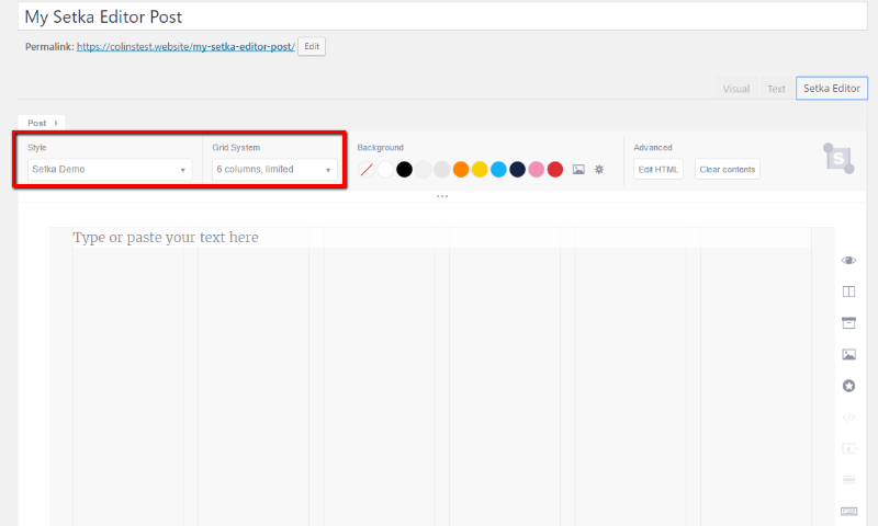
Your first step is to choose the Style and Grid System to use for your post. The style part is self-explanatory – but I’ll show you why the grid system is so important in a second.
In the Editor, you can type and insert media just like you would in the WordPress Editor:
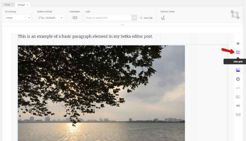
And that’s where the grid system comes into play. Say you want to make the image right-aligned and have it take up 33% of the page. All you need to do is click the Add Grid button and choose your alignment:
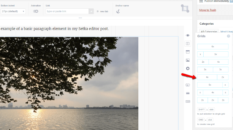
You can always customize how many grids your element takes up by choosing the + or – buttons:
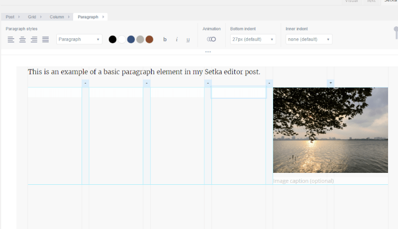
For example, to make that same image take up half the page, all you need to do is click the – button on a grid:
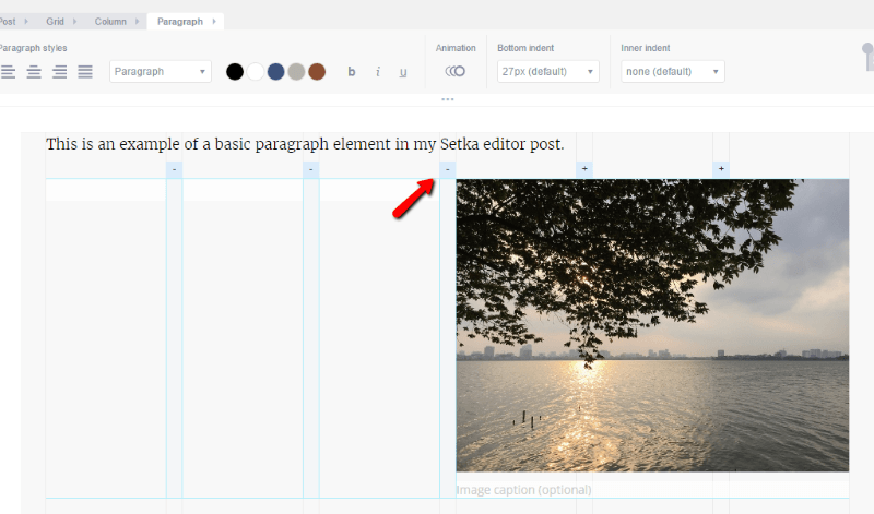
If you’re a web designer, you’re probably nodding along and yelling at the screen “this is why grids are awesome!”
But if you’re just a regular WordPress user, this should pretty mind-blowing. The grid system gives you perfect control over every element on your page in just a few seconds.
Beyond styles and the grid system, Setka Editor also includes some page builder like features to add advanced styling to your page.
For example, you can quickly add:
- Animation
- Icons
- Snippets (basically equivalent to page builder elements, but they’re more flexible because you create them with raw HTML)
- Dividers
- Image galleries
And Setka Editor also includes keyboard shortcuts to make it possible to do all of this lightning-quick.
For example, if you defined a snippet in your Setka Styles, you could instantly insert already-styled elements like this:
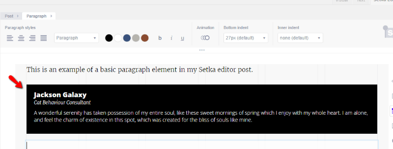
And then you could tap a few keyboard shortcuts to set up the grid system for that element.
Defining Your Grid Systems and Setka Styles
To actually set up your grid systems and styles, you need to use the interface at Setka’s website.
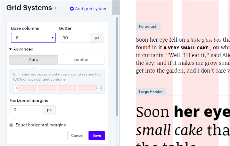
When you build your grid, you can quickly select columns, gutter (that is, the space between columns), and width:
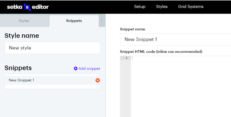
Similarly, when you define your styles, you’ll be able to customize both styles and snippets, including responsive design for each item:
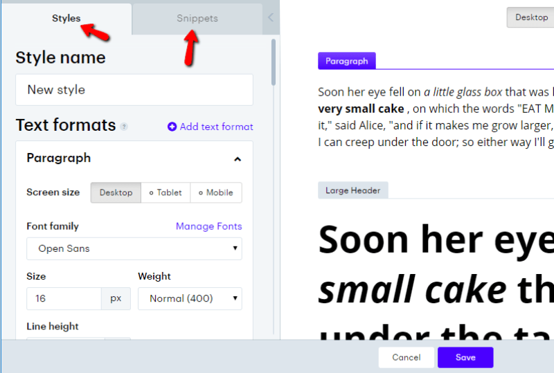
One thing to note is that to create snippets, you’ll need to know HTML. It’s not a visual builder like you might expect with a page builder:
Is There Lock-in With Setka Editor?
Lock-in is something I’m always concerned about with plugins that style WordPress. That is, what happens to your content down the road if you ever need to deactivate the plugin?
Thankfully, lock-in is pretty low with Setka Editor. While you will lose your styling (pretty much unavoidable), Setka preserves the basic HTML and structure of your page.
I’ll throw together a quick example to show you what I mean. Here’s a post built using the Setka Editor:
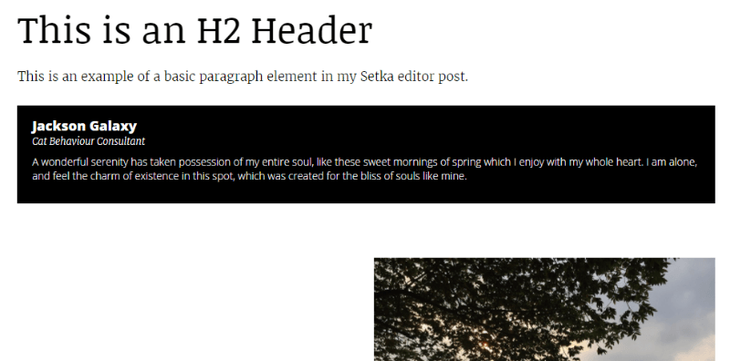
And if you were to deactivate the Setka Editor, that same post would look like this:
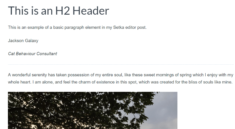
So while you lose the custom styles – the basic building blocks of your page (e.g. the H2 header, the divider) are still there.
Final Thoughts on Setka Editor
Setka Editor is a very slick WordPress plugin. It’s easier (and much faster) to use than a page builder. The grid system lets you quickly lay out your content and the styles make it simple to switch between aesthetics on-the-go.
If you’re looking for something significantly more lightweight than a page builder, but that still allows you to design beautiful and unique pages, you should definitely play around with Setka Editor.
If nothing else, you’ll get to experience a truly novel approach to styling content in WordPress.
Setka’s core features like the grid system and styling are free, though to get some advanced features like icons requires a monthly subscription.
If you’re intrigued, head on over to Setka and check it out. And if you’re interested in a more traditional page builder, you should also read our Elementor review.
