
With more and more internet users accessing websites on their mobile devices, rather than traditional laptop and desktop computers, it’s never been more important to ensure your website is usable on those smaller screen devices.
Combine that with the fact that Google is working hard to promote mobile-friendly websites in its search engine results, and relegating those sites which aren’t optimized for mobile users, there is more incentive than ever to offer your visitors a user experience that is tailored to whatever device they are using.
For any WordPress site owners who don’t have a mobile-friendly website (you can check individual pages here), installing the Mobile Theme from the Jetpack plugin is a quick way to rectify this.
However, if you want to preview how your website will look to visitors on a range of devices, including the leading smartphones and tablets, as well as HD screens, there is a free plugin you can install on your website that allows you to do so.
That plugin is called Responsible and it’s one that allows you to test the responsiveness of your WordPress website, right from the admin bar. In this guide to the Responsible plugin, we will take a look at what this tool can do, and how it can help you.
How to Use the Responsible Plugin on Your Website
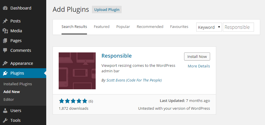
As the Responsible plugin is free to use, it can be installed on your site directly from the WordPress plugin directory.
To do so, log into the admin area of your site (http://yoursite.com/wp-login.php) and then navigate to Plugins > Add New using the sidebar menu.
From the Add Plugins screen, enter ‘Responsible’ in the search field, and then install the first item listed in the results.
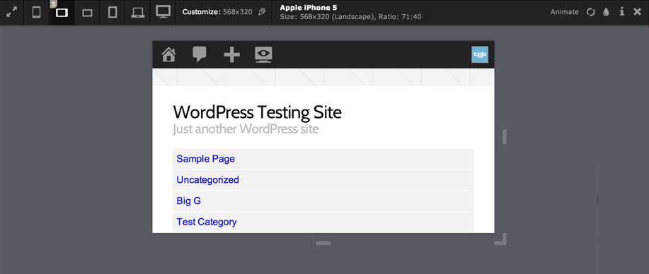
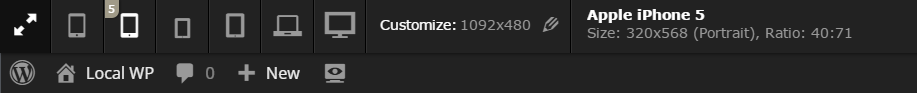
Once the plugin has been installed and activated, a new icon will have been added to the admin toolbar of your website. This is only available to logged in users, and once clicked, will display the different screen size pre-sets included with the plugin.
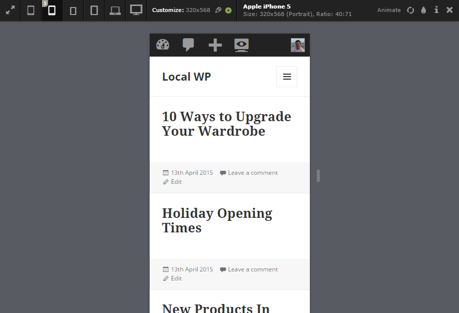
After clicking on the icon, you can then either choose from one of the pre-defined screen sizes, or enter your own custom dimensions for previewing your website.
The viewport will then resize, allowing you to preview your website on the new screen size. You can also drag the corners of the viewport, to resize it manually.
Conclusion
This free plugin can benefit both those doing design work on their website, as well as those adding post content and personalizing the menus and sidebar areas of their website.
Even if you aren’t a designer, bloggers can benefit from being able to quickly resize the viewport and experience your website as your mobile, and large screen, visitors will. This is because it gives you an effective way to test the length of post titles and paragraphs, as well as previewing the length and depth of menus and their links.
As what looks good on a HD screen might not be as legible on a 5″ smartphone display, it’s useful to have the ability to quickly preview your website and its content on a range of screen sizes.
Most modern web browsers either include a similar feature, or allow it to be added by installing an extension. However, installing a plugin of this type on a website can also be a great way to remind clients you are designing websites for, as well as yourself and your co-authors, to check new content and any adjustments being made to other areas of the website, for mobile-friendliness.
If you have any questions about this plugin, or working with WordPress in general, please leave a comment below.