Online sales during the 2018 holiday season are expected to top $123.4 billion in the United States alone. There’s never a better time to generate more sales as an ecommerce business than during the holidays. But many online stores don’t develop a plan to target the right buyers, causing them to miss out on potential customers.
Not all customers are alike, though. If you market to everyone the same way, you’re not going to get the best results, because different buyer personas respond to different messages. I’m going to show you how to target the four different types of holiday shoppers to increase your ecommerce conversion rate.
Holiday Shopper #1: The Evergreen Shopper
The most basic holiday shopper is the evergreen shopper. These are individuals who shop all year-round and are what you’d consider the average consumer.
They’re not obsessed with finding the latest deals and you won’t find them doing their shopping last minute. Instead, they’re more balanced. Your marketing will need to reflect that, bringing me to my first point.
Get Your SEO in Check
A total of 74% of evergreen shoppers use search engines for shopping. So if your SEO isn’t in good shape, you’re not going to get any organic traffic. This means losing sales to competitors that are putting this into practice.
The main component of SEO is the on-page side. Optimizing your pages and products can be done and left to reap the rewards for months to come. It’s a good idea to audit it on a regular basis, perhaps every quarter, but it’s initially set-and-forget.
The result? More organic traffic driving evergreen shoppers to your website.
One of the first steps for optimizing your store is using Google’s Pagespeed Insights tool. This will uncover issues that you probably don’t even know you have. Because pagespeed is a ranking factor in Google’s algorithm, it will help you boost your rankings and creates a good base to work from.
Type in your URL and click “Analyze.” This will scan the website to find common issues that will not only improve the overall user experience, but also how Google ranks your site.
Common issues include:
- Uncompressed and unoptimized images or files
- Too much Javascript or CSS
- No caching to speed up browsers
- No HTTPS
Some of these are simple fixes, such as installing an SSL certificate or a caching plugin. Others will require deeper technical skills, but you should be able to solve most issues and get a nice performance boost – improving your SEO at the same time.
But we’re not done yet. Next, you need to perform keyword research. These keywords will be placed in precise areas to get put in front of evergreen shoppers in the search engines. To begin, sign up for a Google Ads account and navigate to the keyword planner tool.
You’ll want to search for the following types of keywords:
-
- Top-level: A description of your store. This might be “mens tennis clothing store” or “womens gold jewelry store” for example.
- Product names: The title of products you sell, such as “mens brown suede dress shoes” or “12′ HP laptop.”
- Product categories: Phrases that describe the overarching categories, like “mens dress shoes: or “glass tables.:
Pay attention to the monthly search volume. It’s good to have a mix of low, medium, and high volumes to get a variety.
A top-level keyword should be placed in the title tag of your website and on your about page. This helps Google understand what your store is about, ranking for that keyword; when evergreen shoppers are looking for that exact kind of store, you’ll be one of the first they see. You can see the title tag of any website by hovering over its tab in a browser.
You’ll also want to rank for individual products and categories, though. Just like on your homepage, include keywords for these elements in the title tags as well. You also want to place keywords in the URL and meta descriptions. Note that when you enter a phrase into Google, it will bold in the description. This is proven to increase click-through rates, and is a quick win every ecommerce store owner can take.
Holiday Shopper #2: The Early Bird
Some people like to get their holiday shopping out of the way early in the season. That’s why we call them the early bird. They’re all about getting a lot of shopping done at once, and getting it done ASAP.
Keep this in mind because it will play heavily in how you can increase your conversion rate while targeting them.
Speed Up Your Sales Funnel
Imagine the sales funnel of your store like a roller coaster. How fast can users sit down, buckle in, and enjoy the ride?
Some will be waiting for hours, and we all know how dreadful waiting in line feels. You want the sales funnel to shoot users through fast, like a cannon, instead.
The three main parts of every funnel include:
- The product page
- The cart page
- The checkout page
All of these can be tweaked in small ways to increase conversion rates, funneling users through quicker and more easily. One of the primary ways to create a great user experience is to make the user not think. The process should be so simple that they can just do it without questioning anything or getting stumped.
Optimizing the Product Page
If your product pages aren’t exciting, nobody is going to add the items to their cart. The first thing you should do is ensure that you have great images. High-resolution photos from several angles will give the customer a better idea of exactly how an item will appear in person. Having a zoom function is also useful. Always include dimensions, as photos are sometimes deceiving.
Next, clean up your copy. So many ecommerce store owners make the mistake of writing bland product descriptions. They need to be exciting, fun, and speak to the customer’s needs. With that being said, always focus on benefits over features. Remember that features are factual pieces of information: think size, color, or material.
Benefits highlight the emotional connections and deeper reasons why a customer wants to purchase a product. For example, you want them to feel that they’re not just buying a t-shirt, they’re buying increased confidence, better style, and higher self-esteem. You can mix that into your copy by saying “A modern style that will improve any outfit and boost your confidence.” That’s much better than just stating boring facts.
Lastly, make adding to a cart easy as 1, 2, 3. The cart button should be in plain sight and a color that’s proven to work for your industry. For example, black tends to work for fashion brands while red is the most popular in general.
Optimizing the Cart Page
After the early bird has added products to their cart, they head over to the cart page. You’ll want to add some tweaks to ensure that they don’t bounce before making it to the final stage – the checkout.
The first way to do that is with a clear and detailed product summary. Customers should know exactly what they are buying, how much it will cost, and what quantity they chose. It’s also wise to allow them to change quantities and sizes, like ASOS offers below. This saves them from having to manually remove items or add more from the previous page.
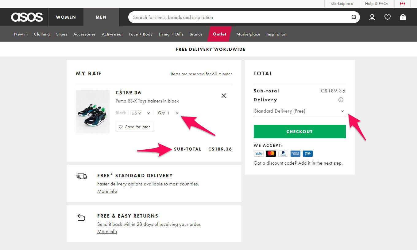
Also, note that the subtotal and shipping information is displayed and selectable before checkout is reached. This makes the purchasing process simpler, helping to increase the number of users converting to paying customers.
Next, ensure that the call to action is bright and stands out. Continuing with the ASOS example, the green button jumps from the screen and grabs your attention. It should proceed in a logical sequence and, in this case, is placed after the subtotal and delivery options.
Optimizing the Checkout Page
The average cart abandonment rate is 69%. That’s nearly three out of every four potential customers leaving before they’ve finished purchasing. Most abandonment happens at the final stage – the checkout page – so it’s crucial you make it watertight.
To optimize your checkout page, begin by making the form short and sweet. Remove any unnecessary fields that add time to the overall process. Asking for too much information may also deter some early birds that value their privacy.
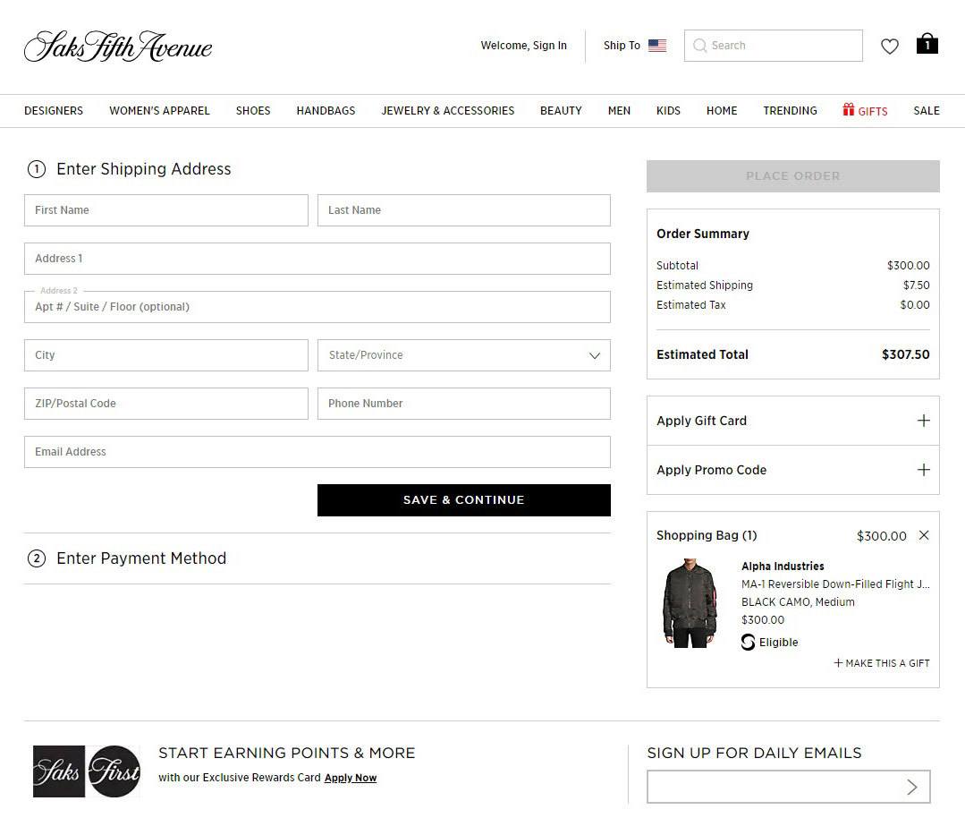
The order summary should also be clear and concise, with shipping and taxes neatly displayed. Just like on the cart page, adding the option to remove line items can be very useful. Display which payment methods you offer so customers know their options ahead of time, too.
Holiday Shopper #3: The Deal Seeker
We all know one – that person who’s always on the lookout for coupons and the latest deals. I mean, who doesn’t want to save money? It makes sense. Discount codes are used by 93% of customers throughout the year. It’s such a common practice in ecommerce that many users expect it.
Here’s how you can better target these deal-seeking consumers during the holidays.
Clearly Advertise Discounts and Sales
Targeting these users should consist of promoting discounts and coupons, and making your holiday specials very noticeable. Top bars and popups are going to be your best friend. These allow you to place the deal they are looking for right in front of their eyes upon landing on your website.
Look how Wayfair pulled this off for one of their 70% off holiday specials:
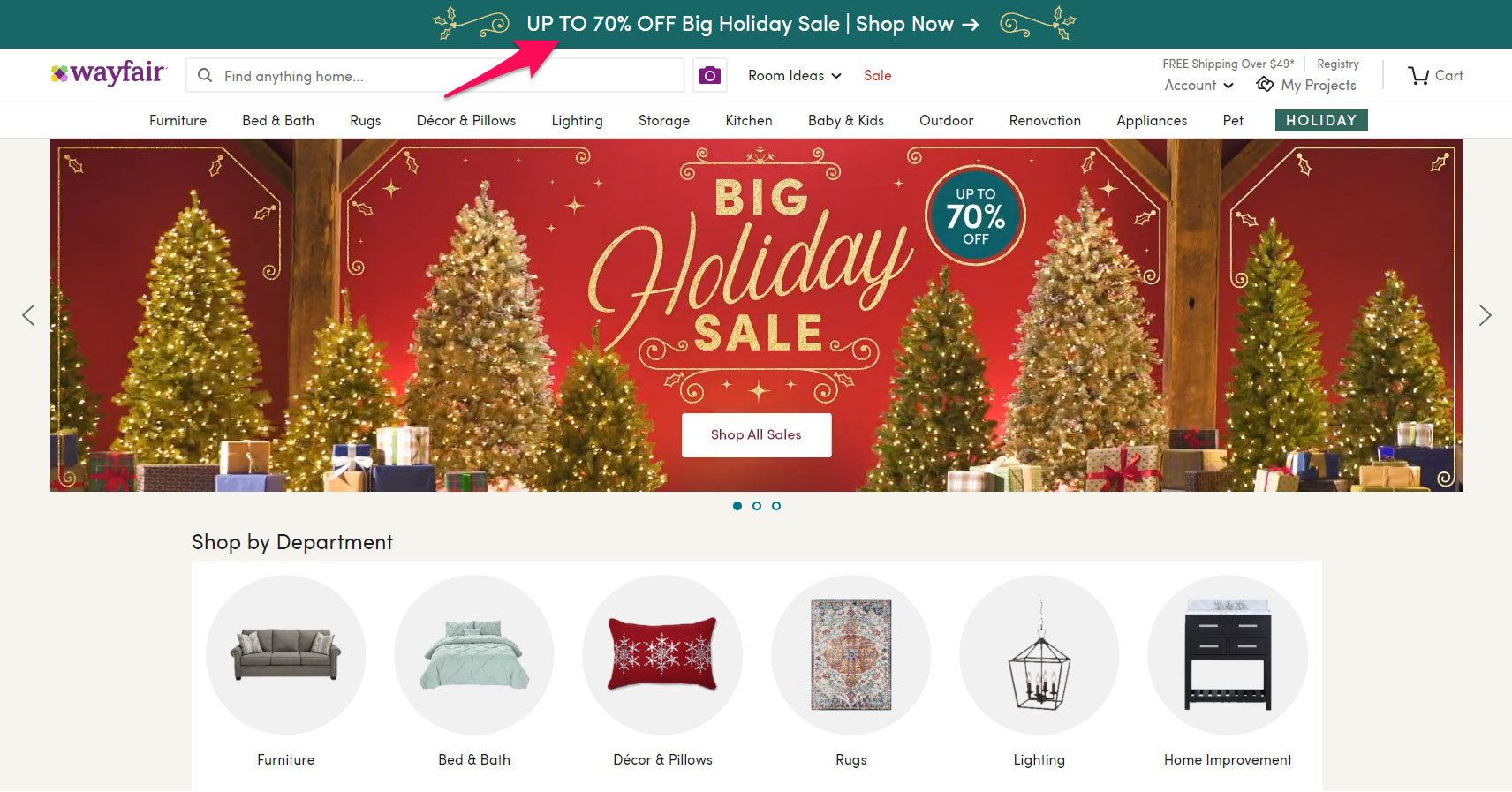
The large banner is impossible to miss, and it features a call to action for users to jump right in to shopping.
Ensure Your Store is Mobile-Friendly
People aren’t just scrolling through Instagram on their phones all day – they’re also shopping, browsing products, and researching future purchases.
It’s way more convenient to shop from a phone on the go than to sit at a computer for hours. This is why you need to ensure that your online store is responsive for mobile devices. Otherwise, you’ll suffer from a high bounce rate.
The average bounce rate for mobile devices during shopping is 48%. That means almost half the users that come to your store from a smartphone will probably leave without visiting another page. You can expect this number to be a lot higher if you don’t have a responsive store – and that means losing out on sales.
To test whether your website is mobile friendly, use Google’s free Mobile-Friendly Test tool. Plug in your URL and hit the “Run Test” button.
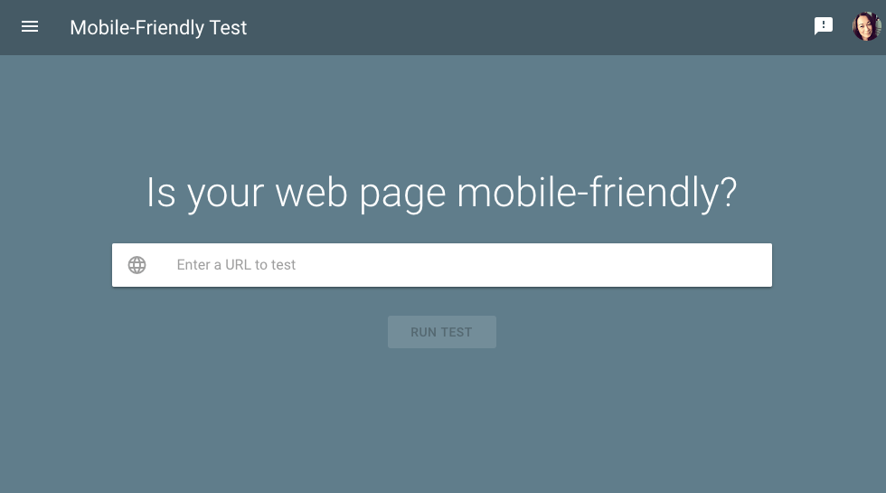
This will display a preview of your website on a mobile device along with a rating of its performance.
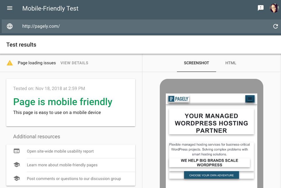
Be sure to fix any issues you experience with loading your store on mobile. Even if your site looks crisp on a desktop or tablet, it might be unusable on a phone. Google and market research company Ipsos found that most deal seekers are shopping from their phones these days.
Display Customer Reviews
A total of 91% of users read online reviews on a regular basis. They provide insight if the product is high quality, will satisfy their needs, and solve a problem they are facing.
Think about the last time you shopped online. Did you check out the reviews to get insight from previous customers? You most likely did, and your deal-seeking customers are no different. They are likely to look at product reviews, meaning you need to have them on display.
If there’s one website we can all look to for ecommerce inspiration, it’s Amazon. Few companies pull off reviews as well as they do.
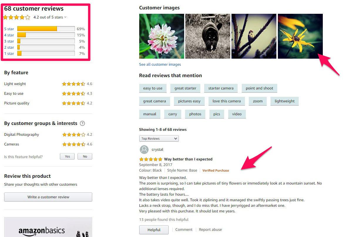
Note how they display total reviews, a breakdown of ratings, customer images, and the reviews themselves. Testimonials help build trust and are one of the best ways to increase conversion rates with all shoppers, but especially with deal seekers.
Holiday Shopper #4: The Last-Minute Shopper
Have you ever done last-minute Christmas shopping? It’s okay – most of us have! If you’ve been there yourself, you know that feeling of urgency. As a marketer, you can use this to your advantage.
Create a Sense of Urgency
There’s a psychological phenomenon known as fear of missing out, or FOMO for short. It’s very literal. It means taking action because you’re afraid of missing out on a good deal or opportunity. See where we’re going with this?
You can increase conversion rates when targeting last minute shoppers by adding more urgency into your copywriting. Look how Joe Fresh makes customers feel like they need to take action so they don’t miss out on a 40% sale.
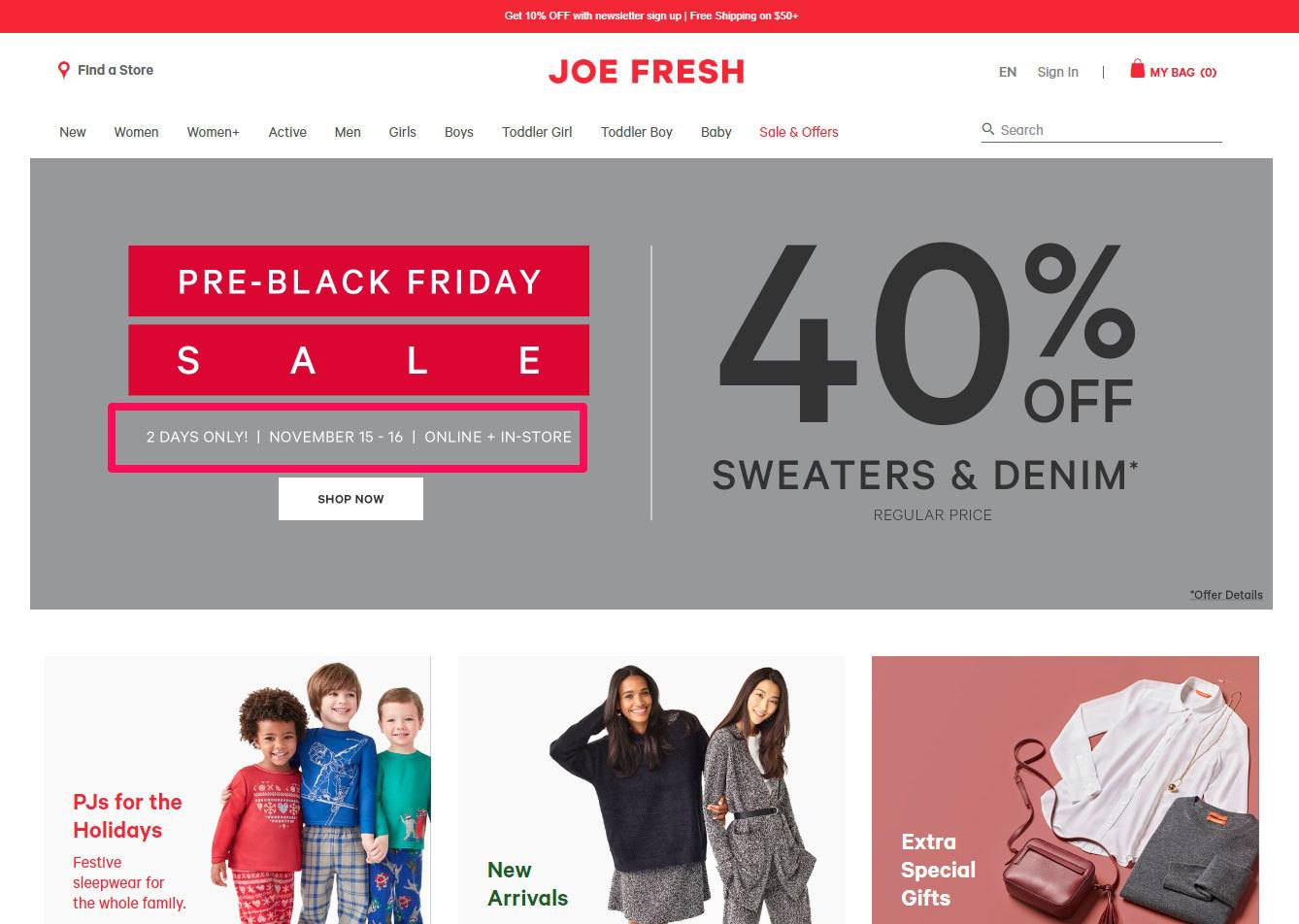
To achieve this same effect, use calls to action like these in your promotions:
- “Don’t miss out!”
- “Limited time only”
- “7 days left”
Use Low Stock Warnings
Another effective way to to increase conversion rates by promoting urgency is through stock warnings. Display a message when the inventory for certain products is low. Customers will feel that if they don’t purchase an item soon, they might miss out.
House of Fraser, a fashion ecommerce company, uses this tactic of displaying the amount of stock left for products and enticing users to purchase them sooner.
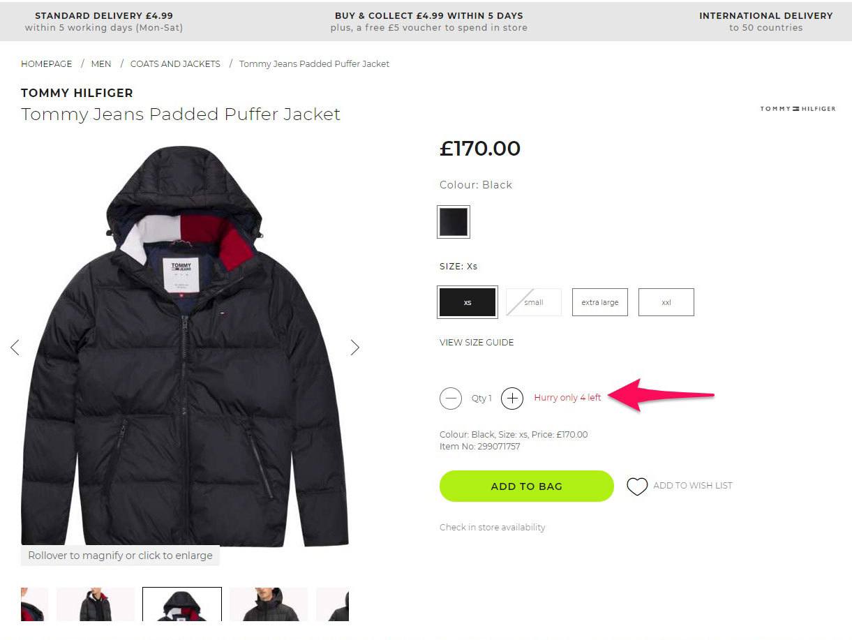
Last-minute shoppers are already crunching time. By implementing urgency, you’re going to tip the scale and convert them to a customer.
Wrapping Up
The holidays can be the most profitable time for your ecommerce store. But you have to do your marketing correctly. Too many entrepreneurs miss out on generating more sales because they market to different demographics with the same methods.
By targeting the four types of shoppers we’ve explored in this article – evergreens, early birds, deal seekers, and last-minute shoppers – in a more direct manner, you can ensure that sales don’t slip through your grasp this holiday season.
So, what are you waiting for? Use what you’ve learned here to develop a marketing plan to lock in your success during the holidays.
