I thought it would be interesting to look back at how page.ly, and flare9 before it, got to where it is today by reviewing past designs of the website and brand.
A quick backstory: Pagely is the 2nd coming of this WordPress hosting idea. In 2006 Sally came up with the idea for a DIY website creation and hosting system based on WordPress. We built it and called flare9. It did not quiet get off the ground so in Early 2009 we rebranded it page.ly and rewrote the code. So here we are today.
The Mark
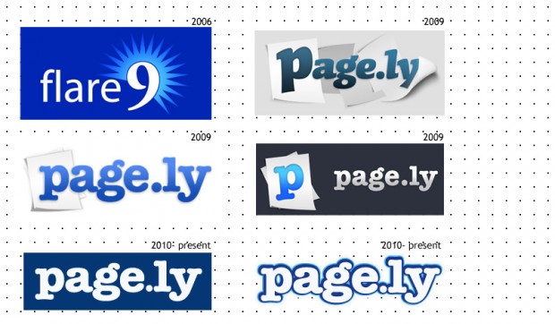
Obviously it started with the flare9 mark in 2006 that really did not change much the entire time it was used. In early 2009 you’ll see the new page.ly mark with multiple leaflets elements. This was a logo created for me by a local designer. I liked where it was going but elected to strip it down to just the leaflet behind the P and changed the typeface to American Typewriter and used that through 2009 and into 2010.
In 2010 I reduced the vertical height of the typeface 10-15% so the letters did not look as tall and created the offset stroke mark we use today on our T shirts and some of our branding.
Flare9 Website 2006-2008
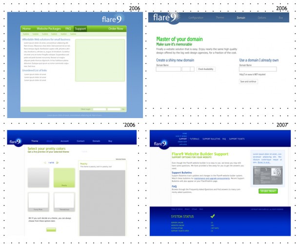
The site went through a few iterations when developing it but finally settled on the dark royal blue and green layout shown in the bottom right. It remained unchanged until it was taken offline in late 2008. Meh.
Pagely Launch 2009
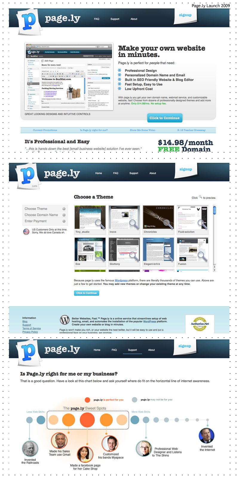
Pagely launched in Late September 2009 with style below and stayed this way into 2010 or so. The leaflet’s were used as style elements but never seemed to really fit in well. We used to emphasize choosing a WordPress theme as the first step of the sign-up process but found that people got stuck there and conversion was fairly low and eventually did away with it all together as moved to streamline our sign-up process. The “is page.ly right for me” graphic also got some laughs.
Pagely v.2 2010
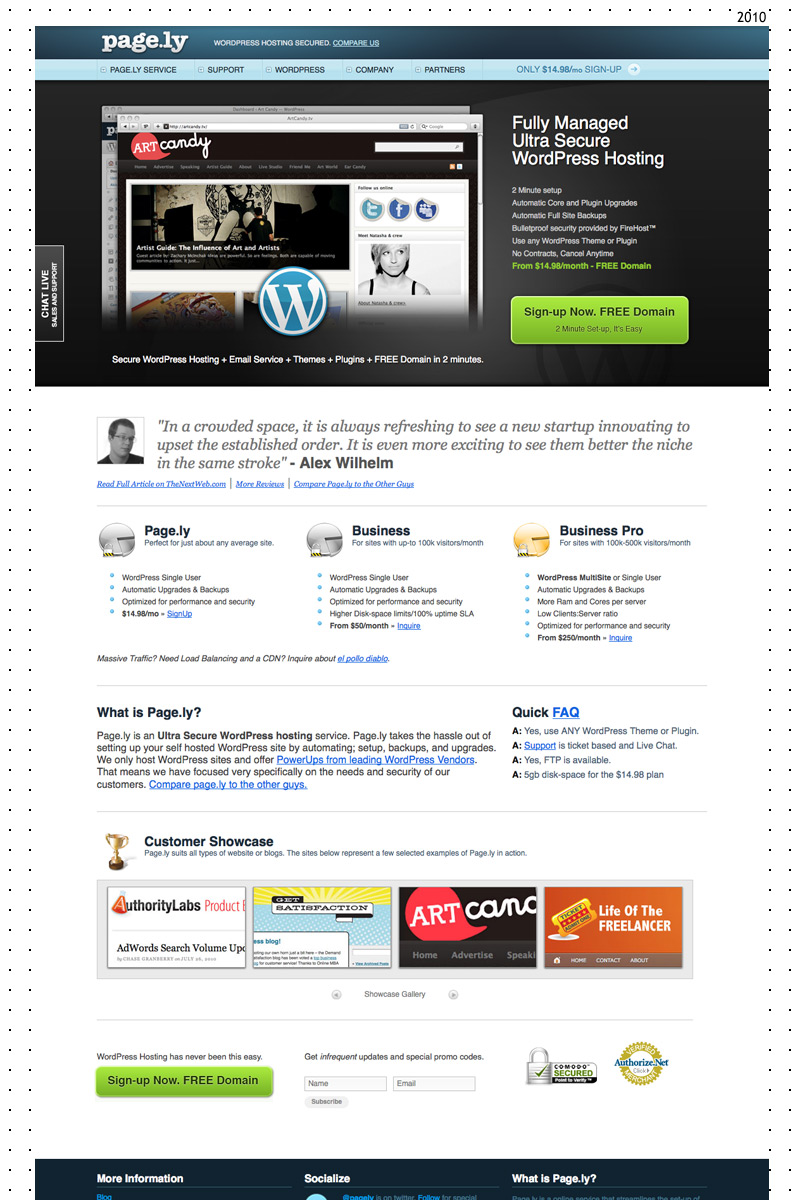
Sadly for some reason I cant find more screenshots of this version and the .psds are a mess. It went through a few iterations as we played with home page messaging and promoting our “powerups” on the home page. After extensive A/B testing we found that simple, clear messaging seemed to work the best but were always in a battle adding and removing things to the home page.
The header was cleaned up and the logo mark begin to shrink. The main navigation was suckerfish dropdown menus that people seemed to complain about. We also A/B tested the main call to action area (black band under nav) with a Video or these website screenshots which came out to be about 50/50, or “no definitive winner” in Google speak.
Of note you’ll also see we pivoted on our messaging a bit. When we first launched we are hosted at theplanet.com and played lead with “quick setup” as our value proposition, by the time we launched the version we were already at firehost.com and leveraged their security into our messaging and began to focus more on the long term value of “managed” hosting. A quick setup is awesome, but we also take care of the customer for the term with ongoing updates, support, and backups.
A look at buttons
Kind of random, but neat to see how button styles change over time.
Pagely v3 2011
This is the design currently in use today and is about 3 months old, but it actually was based off the design of this blog which was done a few months prior. I went for an ultra clean look with clear type and messaging. Lots of white and light grays. We have been A/B testing various elements since it launched.
On all interior pages the navigation bar and our page.ly brand shrink and snap to the top of the page. I felt we just need to subtlety remind people where they are but not yell at them with a 3 inch logo. We did not lose the drop down nav from v2 completely as there are still some links nested under ‘Company’, and some interior pages have a secondary nav in the right column.
And funny enough it was not until v3 that the site was actually powered by WordPress. Up until then it was a custom Codeigniter MVC App. Our sign-up process and the backend is still CodeIgniter but the transition from WordPress to CI is transparent to the viewer.
Well thats that. There were a few other smaller tweaks and iterations along the way however they were minor. This latest design is my personal favorite by far and the conversion rate seems to agree with me. We continue to A/B test elements of the design and ditch what doesn’t work.
Would love to hear your thoughts on this or other design/branding evolutions.


