Landing pages are a marketing essential for any business with a website, as these serve as a web page where you can drive traffic and encourage visitors to take a particular next step. Landing pages are standalone pages, sometimes without a navigation bar, and a single call-to-action to better guide visitors to take your desired action, whether that’s downloading an eBook, signing up for a free trial, or making a purchase.
Ideally, every marketing campaign you launch should have its own landing page because they’re more effective and action-oriented than a general page on your website. Companies that increase their number of landing pages from 10 to 15 see a 55% increase in leads, and those with 40 or more landing pages receive 12 times more leads than those with five or fewer.
Creating a WordPress landing page requires a different design and marketing approach than your website’s other pages, which is why some businesses shy away from creating them. There’s no one single formula for the perfect landing page, as your conversion goals and intended audience will dictate the angle you take. However, understanding the blueprint for a lead-generating landing page can help set you in the right direction.
Whether you intend on using a premium WordPress template or hiring a web designer to build a custom landing page, familiarize yourself with these five essentials for launching a WordPress landing page that converts.
1. A Simple Design with Your Essentials Featured Above the Fold
A landing page should have one specific goal. You’ll have a better chance of converting visitors if you keep the page simple in its layout and guide them toward taking your desired action, which is usually filling out a form to receive something in return. Don’t overwhelm visitors with too many options or links that will take them away from the page. You don’t need pop-ups, flashy images, and supersized text to keep someone’s attention.
While you want to create an easy path for visitors to follow as they scan the page and reach the call-to-action, you don’t want to design your landing page like a ladder where you start from the top and reach the most important information at the bottom.
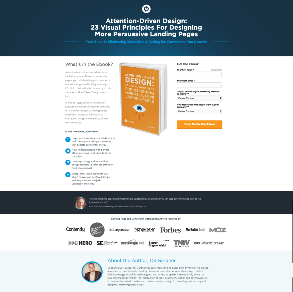
Your most important details-your headline, subhead, and call-to-action- should be above the fold, meaning visitors see the information when they land on the page without having to scroll down. As this part of your page will receive the most visibility, the content appearing here should be attention-grabbing. Unbounce, seen below, does just that with its landing page for a downloadable eBook. The layout is simple, and a visitor knows exactly what they’re being offered when they land on the page.

2. Killer Content That Keeps Visitors Reading
The difference between a good landing page and a lead-generating one is its content. While the amount of content you have will vary depending on your goals, your landing page needs the content trifecta:
- A headline that immediately captures a reader’s attention;
- A subhead that provides a quick explanation on what the visitor can expect on the page; and
- Your value proposition that shares the benefits of your service or product and how it solves a problem.
Rather than explain what your service or product is and list its features, focus on the benefits and what your customers will learn or accomplish. As the largest text on a landing page, your headline should be short, snappy, and intriguing. You could pose a question, such as “What if you could double your productivity with one app?” or use a memorable phrase, such as “Life, Made Easy.” Just make sure it’s accurate and relevant to your company.
The subhead typically acts as a follow-up to the headline, providing support to back up the claim in the headline. The rest of your landing page content will center on your value proposition and provide additional details about your offer. Shopify follows this formula on many of its pages, like the one below.

3. A Memorable Hero Image
When 90% of information transmitted to the brain is visual and visual information is processed 60,000 times faster than text, imagery plays an important role on a landing page. Whether you use a photograph or illustration, a visual representation of what you offer can be more persuasive and compelling than text alone. An image can also help visitors to your landing page better understand what your service or product is.
If you’re providing a product, include a picture of it. If you’re promoting a service, the image should grab a visitor’s attention, while also being relevant to what you are offering. Remember, your imagery doesn’t have to be a blatant depiction. Feel free to get creative, as Flynn did below. While the company is an open-source platform for running apps in production, the duct-taped popsicles are a much more memorable representation of how Flynn helps developers deploy and scale apps efficiently.
Don’t feel restricted to static images. Gifs and short videos make for great supporting materials to your landing page’s text. If you use a video, it’s best to keep it short- ideally no more than three minutes.
4. Add Social Proof and Testimonials
According to Nielsen, 92% of people trust a recommendation from a peer, and 70% of people trust a recommendation from a stranger. Adding a customer testimonial or claim can help persuade visitors to take the next step and can be much more convincing than a list of benefits or product details.
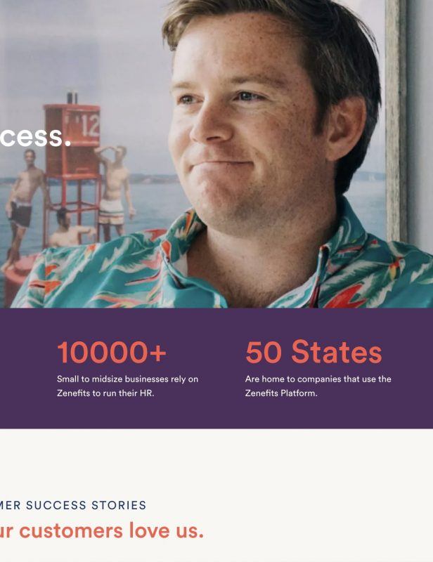
To share social proof on your landing page, start by making a claim, such as “10,000 users rely on us for all of their accounting needs.” Then, back it up with a customer testimonial about your company or the particular product or service you’re promoting on your landing page to serve as proof.
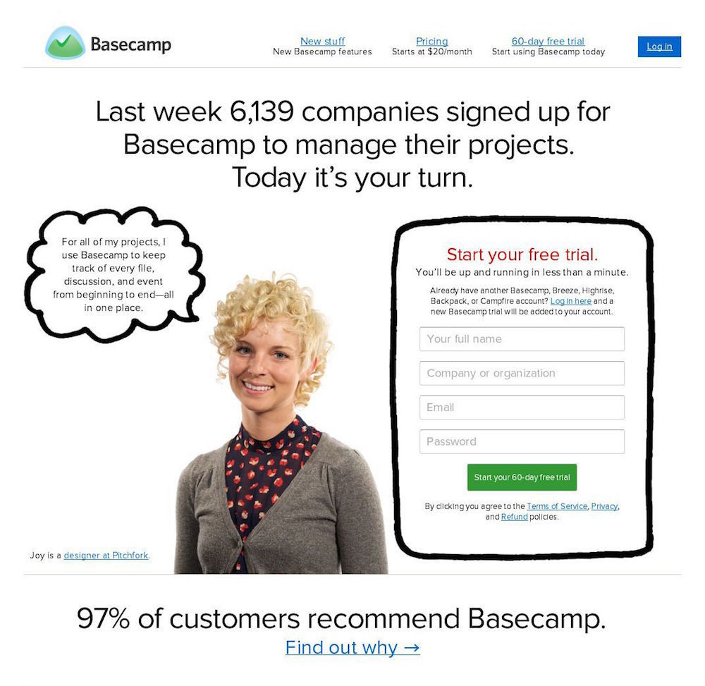
Social proof can take a few different forms. You can share numbers to emphasize your popularity, such as how many customers you have, how many new subscribers you gain each week, or how many followers you have on social media. Or you can tout any awards or trust seals you’ve received, as well as customer reviews or product ratings. You can also mix and match various forms of social proof, such as pairing statistics with quotes, which Basecamp did in this example.

5. A Short and Sweet Form with a Descriptive Call-to-Action
The last, but possibly most important element of a WordPress landing page, is a form with a call-to-action that convinces visitors to take the next step. The form should be easy to find on the page, ideally close to the top of the page.
Keep the form short and sweet. The more required fields, the less likely someone is to complete and submit the form. At the minimum, ask for a name and email address. Depending on the goal of your landing page, you may also ask for a phone number, company name, or other information. One study found that reducing the number of form fields to four or fewer boosts conversions by 160%.
A form isn’t complete without an engaging call-to-action. Avoid generic phrases or words, like “Submit,” “Contact,” or “Download.” Use descriptive action verbs that remind visitors what they’re receiving in return for filling out the form. For an eBook on marketing, you may say something like “Start Mastering Marketing.”
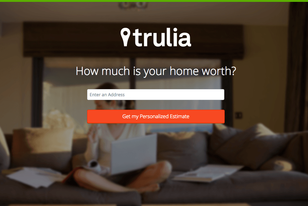
Colors also play a role in conversions. Use a color that pops, such as a bright green, blue, or red. Trulia, as seen below, uses a bright orange for its button color with a clear call-to-action.

The next time you go to build a WordPress landing page, incorporate these five essentials and use some of the examples as inspiration. Experiment with your layout, content, imagery, testimonials, forms, and calls-to-action and watch your conversions increase.
